Amotapes Mangroves Biosphere Reserve
This was probably the coolest class project I ever worked on. No actually, second best. VAMO was cooler but I still really like this one so it's still part of my portfolio to this day even though I do think soooome of the graphic work on this is could definitely use some refinement. For this project, I designed a brand identity proposal for the Amotapes Mangrove Biosphere Reserve in Tumbes and Piura, Peru. I was assured this was going to be considered by the Peruvian Ministry of Culture as a genuine proposal for the Reserve – apparently they were looking to redesign its brand. However...this didn't pan out and at the end of the semester the selection jury that showed up to our final presentation kinda flaked out on us and nothing came of it. Still though. I had fun working on this. Partly because my professor for this class (shoutout to prof. Iraola) was amazing and I learnt a lot from him.
Anyways. Back to the case study. Part of the need behind this new branding proposal was to differentiate the identity of the Reserve from the Ecuadorian reserves nearby and attract attention (and business!) from three main target industries: Tourism, Mining and Scientific Research/Conservation. Obviously this means the brand identity needs to be unique and innovative, but also project a professional and business-ready image.

The first step was to create a strong conceptual base on which to build the identity. After an arduous research process which I carried out with the help of the Reserve's personnel, I decided to go with three main concepts because they really encompassed the ideals behind the project: conservation, ecoethics and productivity.

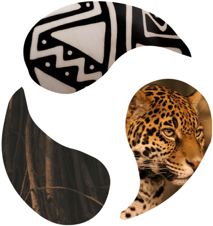
In addition to the concepts, I also chose three representative elements of the reserve to use as visual inspiration for the final brand design: Chulucanas ceramics – a specific ceramics style indigenous to the Tumbes and Piura territory, the jaguar - an endemic animal that's a key part of the ecosystem, and the roots of the mangrove tree – also an endemic species and the one the reserve is named after.
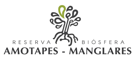
The logo
The final logo represents both the shape of the mangrove tree and the face of the jaguar; using patterns, colours and shapes inspired by the high contrast glazing from the Chulucanas ceramics.
I also shortened the name of the reserve on the logo itself to make it easier to read and remember. It went from "Reserva Biósfera Natural Amotapes Manglares" to “Reserva de Amotapes Manglares”
Aside from the logo, I came up with to supplementary patterns to be able to create some extra design elements for the brand. These were based mainly on the mangled roots of the mangrove tree and it's leaves - still mainly using a monochrome palette to emulate the Chulucanas ceramics.


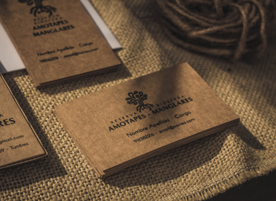
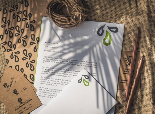
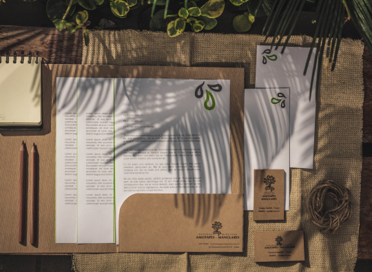
Stationary
To transmit the concepts I initially proposed and make sure the Reserve is able to send out official communications in line with the new brand from the get-go, I created some basic stationery pieces that uses the new brand elements. In retrospect, I should have created digital elements to go along with these, but I was a naive student and I hated online marketing and loved physical stationary. I still hate online marketing and love physical stationary but I've actually worked on marketing projects now and so this has gone from an opinion borne from vibes to one based on experiences. This, however, doesn't mean I'm bad at online marketing, just so you, potential employer reading this, know.
>Back to the case study! Because I love stationary and one of the concepts behind the project was conservation, I made sure to select recyclable, eco-friendly materials to print the stationary. I went with a classic, recycled kraft paper and cardboard. This also lowered printing costs considerably, which was a nice benefit. I tried finding more eco-friendly ink but my research at the time bore no results. Nowadays I realize water-based inks were probably what was used on the trial print runs and therefore...not terrible! This was not intentional though.