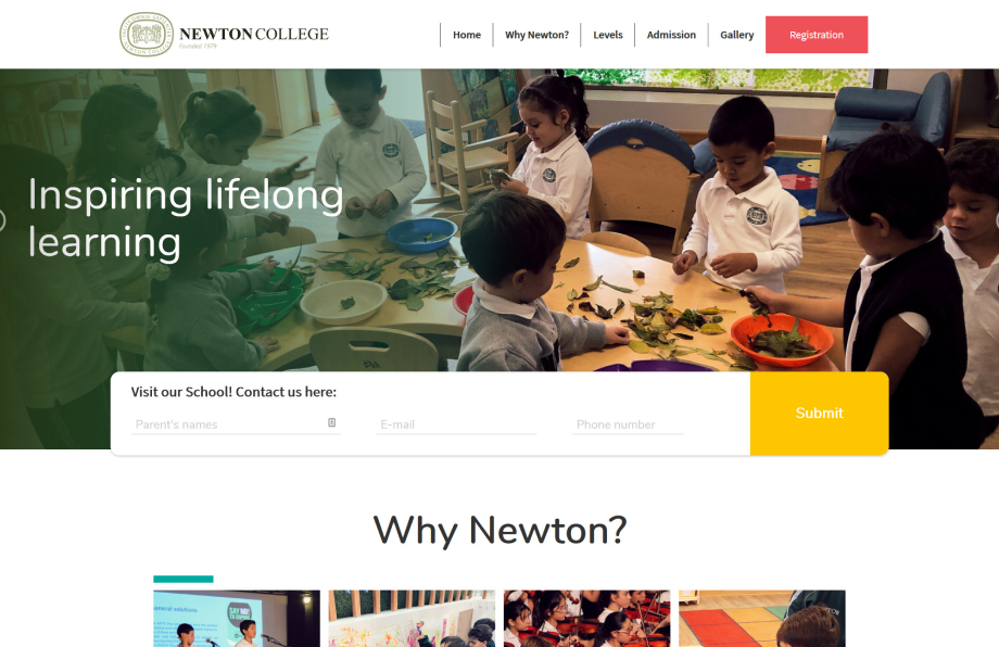
Landing Page de Newton College Admissions

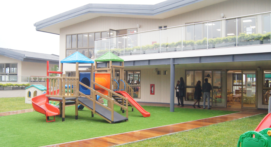
In preparation for the admissions season for new students, Newton College needed a landing page to attract parents of future students to enroll in their school. Specifically, they wanted to highlight the newly available enrollment slots for 2-5 year old children for their Early Years pre-school program. They also wanted to emphasize the school’s newly redesigned specialized infrastructure.

Figure 1: Newton College's campus.

The problem

Enrollment for the Early Years pre-school program (launched in 2017) was not meeting initial expectations. Because of this, they wanted to improve their digital presence and competitiveness - starting with a landing page that offered key information for parents to motivate them to contact, visit and coordinate with the school administration to enroll their kids in the program.
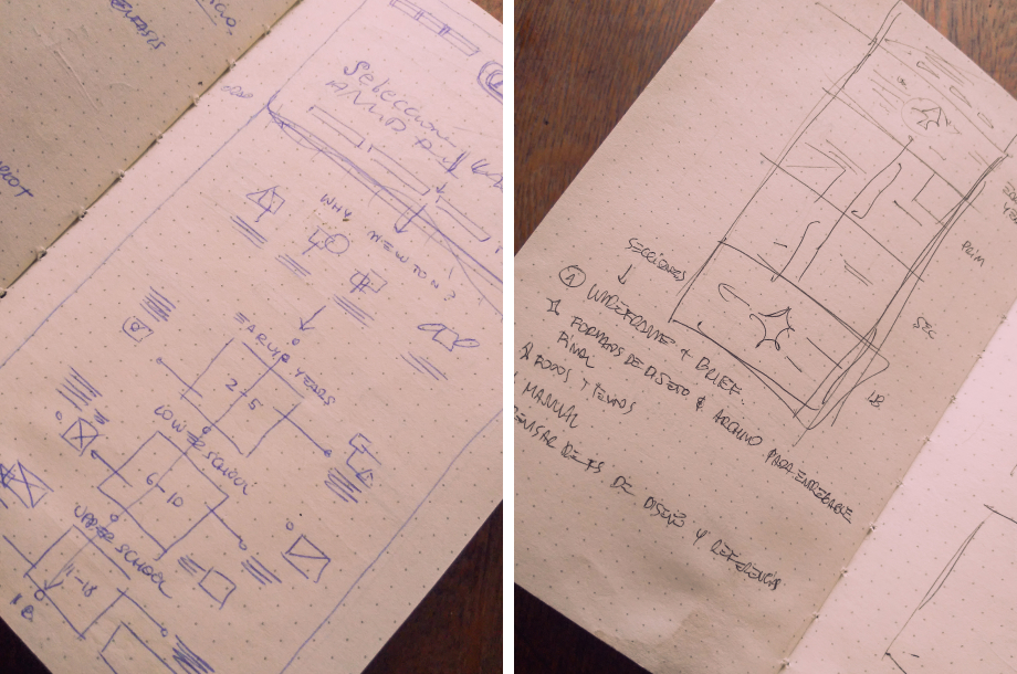
Scope and goals

After talking to their marketing and admissions teams, we all agreed the landing should:

  1. Emphasize the benefits and offerings of the school's Early Years program.
  2. Highlight the main attributes of the institution. Eg: infrastructure, personnel, extracurricular activities, among others.
  3. Showcase the fact that all Newton College students receive special preparation to enter the International Baccalaureate program later on.
  4. Convince parents to register on the landing page to set up a school visit/tour.

The work

During the initial meeting with the school, I drew up some simple sketches to visualize the information I’d been given. Some of this included highlighting the special pipeline from Early Years to the IB, which enables kids to seamlessly transition from each level of education to the next. This enables them to study abroad more easily once they reach university age.

Figure 2: New infraestructure for the Early Years program.

I decided to use a simple timeline design to highlight this pipeline, and to deviate slightly from the more adult, formal visual style the school uses normally to adapt their image to the fact this program is directed to parents of very young children.

Figure 3: The drafts I drew up with the school representatives.

I also chose to use the secondary colors in Newton’s palette (light blues and light greens, with red and yellow as accents) in order to give the page a more lighthearted look and emphasize its focus on the Early Years program.

Figure 4: Selected colours.

Resultados

The school selected the second prototype I showed them and I built the page with basid HTML and CSS. Their IT team helped with the hosting and adding a couple extra necessary features. The landing can be found here. Apparently, it continues to be used!

Figura 5: High fidelity prototype for the landing page.